Friday, August 27, 2010

Saturday Sketch Challenge 166

Hey Hey Hey Happy Stampers!

How about another awesome sketch challenge from your 411 operators. When I drew this one out, I thought that some of you may feel nervous about an oval.. (just like last week's circle element). However, feel free to substitute for ANY shape that you might have including a rectangle.

Try to keep it simple and fun! Now for more fun! Check out what our featured Stamper Lynn Mangan did with this week's sketch.. Isn't she talented??

She asked me to post the card that I liked best..... Well ~ I LOVE them both! So, I thought I'd share them here. If you love her card, please leave her a comment on her blog here. While you are there, you may want to check out the most EXCELLENT versamark tutorial that she wrote for us this week! Thanks Lynn for sharing your talents with us!

So now that we've had some fun, how about talking measurements for just a moment. Miss Robin is on top this week so I'm going to do some potential measurements for you based on her creation.

Base: 8 1/2 x 5 1/2" scored and folded in half at 4 1/4"
Layer 2: 4 x 5 1/4"
Layer 3: 3 3/4" x 5"
She's got a bunch of ribbon layered between the next layers.. I love how she used ribbon in place of cardstock. If you are going with paper, just make it the same length as layer 2... in this case 5 1/4"
Layer 4 and 5, I believe are big shot ovals
And layer 6 are the numbers...

I bet that has some special significance!!! If you want to read more about the operator creations below, just click on their names below or on the right hand sidebar.

If you're uploading your card to an online gallery, please use keyword SSC166. If you've never done a challenge and you're looking for a place to post your cards so folks can see them, one of my favorite places to post cards is stampin addicts. If you want, you can check it out!

Above all please have fun and just go for it! Does the thought of cutting your card stock using measurements baffle you? Well, you can check out the most awesome post on how to read a ruler written by the very lovely and talented Lee Conrey, by clicking here.

Without further delay... Here are your operator submissions for sketch SSC166.


Robin Merriman


Gretchen Barron


Kerin Sylvester


Tiffany Bauer


Selene Kempton


Connie Babbert


Lee Conrey


Patti Chesky

Now it's your turn :D Never played with us before?? Well, it's easy! Sky's the limit!
  1. Make a card
  2. Post it online somewhere to your blog or other online forum
  3. Post a link to the free linky tool below (please point the link to your post and NOT just your blog)
  4. Have some fun and leave comments for each other (and for the operators if you like their work). ~ Everyone loves comments!
We hope you join us this week and play along with this sketch! But don't delay our links will close at 8AM on Thursday morning Eastern Standard Time.


Stampers Showcase #165


Amazing cards this week, everyone! Here are your Operator Picks for Challenge #165. Keep them coming!

Thursday, August 26, 2010

Color Inspiration #138


It's Wednesday night when I am typing this post, and it is exactly four months until Christmas. Oh my!

I actually bought my first Christmas gift today. It's a silly gift for my husband, but it's my first present nonetheless.

Christmas just seems to roll around the corner way too fast. I thought it would be fun to show you one of the cards I designed for an upcoming Christmas Card class.


For this week's Color Inspiration Challenge, I used the main colors on my non-traditional colored holiday card.

This week the colors are Blushing Bride, Peach Parfait and Elegant Eggplant.

To me, Blushing Bride and Peach Parfait work perfectly together to make a sunset. Have you seen Kerin's tutorial on making a sunset?

The Elegant Eggplant provided a deep, rich color for the trees. The snow on the trees came from dots and dabs of Moonlight Smooch Pearlized Accent Ink. I really an enthralled with the effect it created!!!

It's impossible to see on the picture, but the snow on the ground has been highlighted with some Illuminate Top Coat Smooch Pearlized Accent ink.

This is such a simple card to make, but it is so dramatically pretty! Sounds like the perfect holiday card to me!!!

How would you use these colors together? We can't wait to see what you come up with!!! Make sure to use the Linky Tool at the bottom of this post to link your project to our blog.

Card Recipe

stamps: Scenic Season
paper: Elegant Eggplant, Whisper White
ink: Elegant Eggplant
accessories: Ticket Corner punch, Basic Rhinestones, Moonlight Smooch Pearlized Accent Ink, Illuminate Top Coat Smooch Pearlized Accent Ink, sponges

Wednesday, August 25, 2010

How To Use Versamark, A tutorial by Featured Stamper Lynn Mangan

Good Morning Friends!

It is my Great pleasure to introduce Lynn Mangan a.k.a mango boys and me who has generously agreed to be our featured stamper for this week! Lynn plays along almost every week with the operators at 411 and we always look forward to seeing what she's up to. Surprisingly, she's NOT a demonstrator! She just loves to share her creative talents (and we love to see what she's got for us). Please leave Lynn some love (comments) so she knows that you loved her tutorial and hopefully she'll inspire you to pull out your versamark pad.

How about some more details?... Lynn is a mom to four boys, Ryan, Jonathon, Collin and Marcel. She is married to her high school sweetheart Pat. She states that she is very blessed that he is a stay at home dad to their four boys. She works full time.

So ~ here is Lynn's tutorial all about Versamark... Lynn writes:

"Hello there! The fabulous SU Demonstrators on the Stampin’ 411 Blog asked me to do a tutorial! I got to choose the topic and I picked Versamark. If you’re anything like me, you’re always looking for ways to stretch your crafting supplies. Versamark is the perfect addition! I’m going to share three ways to use your Versamark!

Tone on Tone…
First up is tone on tone. Ever get frustrated that you don’t have a stamp color to match your paper? Versamark quickly stamps and makes the stamp just a shade darker than the color of your paper….the best part…it always match!
Here’s a quick example:
To get started pull out your Versamark, paper and stamp of your choice.

For this card, I decided to use one of my favorite stamp sets Tart & Tangy and make some oranges, lemons and limes in different colors. Versamark dries pretty quickly and if you touch it doesn’t really mess up like crafting ink. After stamping the circles, I punched them with a 1 ¼” circle punch and cut a few of them in half. Don’t you love the colors this creates? Six different colors and only one ink!


To finish off the card, I stamped the sentiment in Tangerine Tango, embossed the white layer and added some ribbon. The full circle fruit was adhered with adhesive and the half fruit was applied with a Stampin’ Dimensional (another one of my favorite supplies!).

Card Dimensions: Base of card: 5 ½ x 8 ½”; White layer: 5 ¼” x 4”
Stamps: Tart & Tangy, Short & Sweet
Ink: Versamark and Tangerine Tango,
Paper: Whisper White, Tangerine Tango, Only Orange, Wild Wasabi, Certainly Celery, Daffodil Delight, So Saffron; Ribbon: SU Pumpkin Pie;
Accessories: Embossing folder, large dots.

Chalking with Your Versamarks
Another great way to use your Versamark is my utilizing your chalk. To get started, decide on what paper you’d like to use along with the stamp.


I utilized my Pocket Silhouette to stamp all the way across the card. After stamping, I dabbed the cotton ball in the various orange, yellow and reds to dab lightly on top of the Versamark. The Versamark is very forgiving so if you add too much of one color, dab the cotton ball in the color you’d like more of and go back over the Versamark. Here’s the end result:


Card dimensions: Base: 6 ½“ by 6 ½”; Second Layer: 6 ¼“ by 3”; Third Layer: 6” by 2 ¾“
Stamps: Pocket Silhouettes and Short & Sweet
Ink: Versamark and Pumpkin Pie
Paper: So Saffron, Pumpkin Pie and Very Vanilla
Accessories: Pumpkin Pie Ribbon

Creating a Monochromatic Background/Embossing
Versamark is also great for heat embossing. If you’re like me, you may not have a lot of embossing powders or embossing inks. Versamark with clear embossing powder allows you to expand the colors that you emboss.

For this card, I started with the background paper in Marina Mist.

I stamped the entire background with the scroll stamp from the Elements of Style stamps. I then applied clear embossing powder and heated it with my heat gun. The end result was the beautiful background.

To finish up the card, I stamped the other images on the front panel with Baja Breeze and Marina Mist.
Card Dimensions: Base: 5 ½” by 8 ½”, Second Layer: 5 ¼” by 4”; Third Layer; 4 ½” x 3 ½”; Fourth layer: 4 ¼” x 3 ¼”
Stamps: Elements of Style
Ink: Versamark, Baja Breeze and Marina Mist
Paper: Marina Mist, Baja Breeze and Whisper White; ;
Accessories: Embossing Powder, Clear

Hope you enjoyed the tutorial! Are you ready to go try out Versamark?!!"

Thanks Lynn for that amazing tutorial! You are a truly talented stamper! Please join us tomorrow for Patti's color Inspiration! (and please don't forget to leave Lynn some love).

(((rubbah hugs)))
Selene~

Friday, August 20, 2010

Saturday Sketch Challenge 165 ~ SSC165

Good Evening Friends!

How fun! Another fun and simple sketch from the operators at stamping 411.

To see the operator creations and read all about their cards, just click the link on the right hand sidebar at the top.

If you're uploading your card to an online gallery, please use keyword SSC165. If you've never done a challenge and you're looking for a place to post your cards so folks can see them, one of my favorite places to post cards is stampin addicts. If you want, you can check it out!

One potential set of measurements could be:
Base: 11 x 4 1/4", scored and folded in half at 5 1/2"
layer 2: 4 x 5 1/4"
Layer 3: (you could cut a circle or use a circular stamp for this element..
Layer 4: (strip up the right hand side of the card or a piece of ribbon).
layer 5: (focal point large white 2 1/2" x 3 1/2"
Sentiment, punched and tucked underneath layer 5.

Above all please have fun and just go for it! Does the thought of cutting your card stock using measurements baffle you? Well, you can check out the most awesome post on how to read a ruler written by the very lovely and talented Lee Conrey, by clicking here.

Without further delay... Here are your operator submissions for sketch SSC165

Patti Chesky


Robin Merriman


Gretchen Barron


Kerin Sylvester


Tiffany Bauer


Selene Kempton


Connie Babbert


Lee Conrey


Now it's your turn :D Never played with us before?? Well, it's easy! Sky's the limit!
  1. Make a card
  2. Post it online somewhere to your blog or other online forum
  3. Post a link to the free linky tool below (please point the link to your post and NOT just your blog)
  4. Have some fun and leave comments for each other (and for the operators if you like their work). ~ Everyone loves comments!
We hope you join us this week and play along with this sketch! But don't delay our links will close at 8AM on Thursday morning Eastern Standard Time.
Stamper's Showcase #164


Amazing submissions this week, everyone! Thanks for playing along. Here are the Operator Picks for #164.

Thursday, August 19, 2010

Color Inspiration #137


Happy Thursday everyone!

This week our color inspiration comes from a home decor item.

I am on a desperate search for new bedding. I just can't seem to find what I am looking for!!!

In my search, I came across this interesting color combination from this comforter at Bed, Bath and Beyond.

The colors are Certainly Celery, Tangerine Tango and Wild Wasabi.


How would you use these colors? Something tropical? Masculine card?


I can't wait to see what you come up with!!

Make sure to link your fabulous project to our blog using the Linky Tool at the bottom of this post. Just copy and paste your project's web address into the tool. It's THAT easy!!!!

Until next time.....Happy Stamping everyone!


Wednesday, August 18, 2010

How to Sponge a Sunset

Good Morning Friends!!!

Our fabulous operator Kerin has an amazing tutorial for you today! Make sure you leave Kerin some love if you like it! First, the supplies used for this card are at the top:

Stamps: Inspired by Nature

Ink:
Daffodil Delight, Peach Parfait, Pumpkin Pie, Cajun Craze & Cherry Cobbler classic stampin' pads

Card Stock: Shimmery White, Basic Black, Daffodil Delight

Ink: Black StazOn

Accessories: Basic Black Satin Ribbon, Brights Buttons, Linen Thread, plain white copy paper (non-SU!)


Kerin wrote:


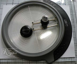
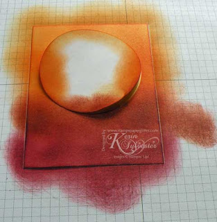
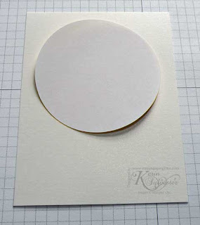
"Today I'm going to show you how to sponge a sunset. For my card I've made a large sun, but you can make your sun any size you like, simply by cutting a different sized circle using your Circle Scissor Plus. For this card, I've set my Circle Scissor Plus to make a 3 1/4" circle out of plain white paper.

You will use both pieces of paper after the circle has been cut out, so don't throw away either piece.


*Tip - I prefer Shimmery White card stock for sponging sunsets, the colors seem to blend better with this type of card stock.

First, select the colors you'd like to create your sunset with. I'm using Daffodil Delight for the sun, along with Peach Parfait, Pumpkin Pie, Cajun Craze and Cherry Cobbler for the sunset.

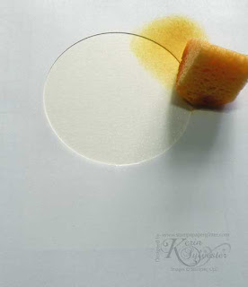
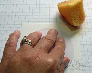
After you've got your circle cut out, lay your piece of plain white paper over your 4 x 5 1/4" piece of Shimmery White card stock. If you use thin white paper, you'll be able to see through it to line up your "sun" where you want it.

We will begin with the sun. Hold the piece of white paper in place, and start sponging outside of the circle, then bring the sponging in, swirling your sponge around in a circular motion as you go.


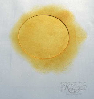
Continue sponging on Daffodil Delight ink until the sun has been completely filled in with ink.


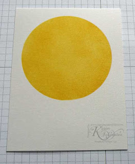
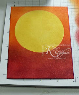
When you remove the piece of white paper, your sun will look similar to this:


Next, take the circle that you cut out from the plain white paper, and place it over the sun you just sponged as shown.

*Tip - for a smaller sun, punch a circle out of a post it note, and it will already have a sticky back to it to help hold itself in place.


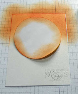
Now start sponging with your lightest color first, in this case it is the Peach Parfait. Again, just like sponging the sun, begin off of the card stock and work the color in from the sides in a circular motion.


This is what it will look like after adding the Peach Parfait:


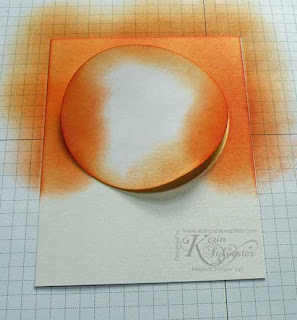
Next add the Pumpkin Pie ink, and overlap the section of Peach Parfait.


Next sponge on the Cajun Craze.

*Tip -Notice how especially on the darker colors I started rubbing my sponge way off of the card stock, this is because you don't want a dark blotch in your sponged area and you can blend more easily if you just add layers of color.


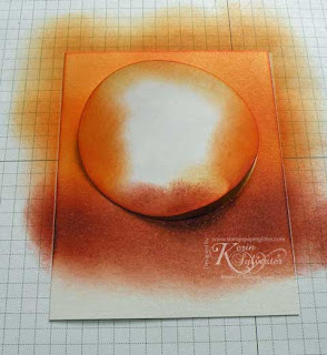
Finally you will sponge on your Cherry Cobbler.

*Tip - Feel free to expand your colors up and down as you like, blending each color in the the color above and below it.


Here is your completed sunset, just stamp and assemble your card!


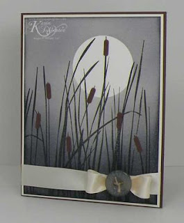
This will work with lots of color combos, here's a card I made in all Basic Gray, I just added the Basic Gray more and more to get the level of darkness at the bottom."

Thank you so much Kerin for your AMAZING tutorial! I'm sure all the Stamping 411 readers will be off to try your technique!

Rubbah hugs,
Selene Kempton