
Hello everyone and welcome to Takin’ It to the Top on Stamping 411, our monthly feature where we take one basic card and step-it-up two times to fabulous and beyond! We hope to show you what a difference it can make in your stamping projects when you add just a few extra elements – texture, color, layers, dimension, embellishments, etc.
Today’s cards feature the new stamp set, Pennant Parade, available from Stampin’ Up! beginning July 1st in the new 2011-2012 Idea Book and Catalog. It uses a bit of Cheerful Treat Designer Series Paper (a new Hostess option) and the colors of Concord Crush, Bashful Blue, Melon Mambo, Pretty in Pink, Daffodil Delight and Pear Pizzazz!
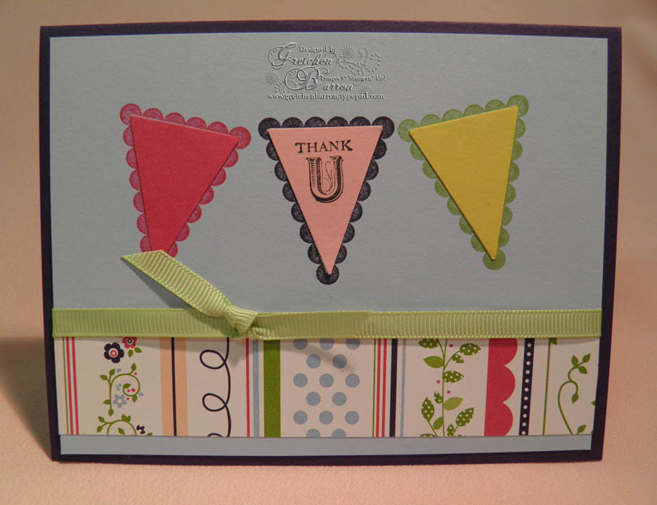
Above is our first card. It’s basic and simple, but it’s also fine as it is. The scalloped pennant images are stamped directly on the Bashful Blue cardstock and the inset triangles are punched with the new Petite Pennants Builder Punch (also in the new catalog). The ribbon is 1/4” Certainly Celery Grosgrain and the sentiment was stamped with Black Stazon Ink.
 Okay, ready to step this basic card up just a bit? You can see that we’ve added some dimension by punching out both pieces of the pennant (scallop backing and triangle) and mounting them with Stampin’ Dimensionals. I used the Big Shot and the Perfect Polka Dots Impression Folder to give the Bashful Blue layer some texture. I changed out the ribbon to 1/2” Poly Twill in Concord Crush to add even more texture and contrast. And, I added an additional touch of whimsy and contrast by putting a Scallop Punch Border on the DSP layer in Melon Mambo.
And now, we’re ready to take this card to the top! Now remember, when you add elements it will take you longer to complete your cards and projects. But for a really special card for a really special person, isn’t it worth it?
 And here’s the final card with even more texture, color, layers and dimension!
I inked the edges of the Bashful Blue layer with Concord Crush Ink. I switched the bow to the other side for more balance. I added some embossing to the triangle inserts in the pennants with the Big Shot and various Impression Folders. I stamped the scallop border on each of the scallop Pennant punched pieces and attached them so they look as if they are hanging on a line, using White Baker’s Twine, adding a tiny bow at each end. Finally, I added a couple of very tiny embellishments, a flower punched with the Itty Bitty Shapes Punch Pack and a butterfly cut with the Beautiful Wings Embosslet and the Big Shot. Each of those are further embellished with tiny Basic Pearls.

So, there you go – three different card using the same colors, stamp sets and basic design and stepping each one up just a bit to add interest and make it more special!
I’m so glad you came for a visit at Stamping 411 today! If you find yourself stepping up your cards and projects a bit this week, we would love to see what you do. Just leave us a link to your blog post below! We can’t wait to see how you take your projects TO THE TOP!
We hope you’ll visit again soon!


I love your "Takin' it to the top" segments!!! It's so fun and really inspires me to take another look at my creations and see how I can step it up. TFS!
ReplyDelete